
Freeman Mobile
My Role:
UI/UX Designer
Team:
Product Manager
Technical Delivery Manager
Tools:
Figma
Timeline:
May 2025 - (Still in progress)
Problem
Freeman's website platform faced a critical usability challenge that was impacting business operations and user engagement. The existing website lacked responsive functionality across desktop, tablet, and mobile devices, creating significant barriers for users accessing the platform during events. This was particularly problematic during trade shows and events, where attendees relied on mobile devices rather than laptops to navigate event information and services. The poor mobile experience was driving users away from the platform precisely when they needed it most, hindering Freeman's ability to serve their event audiences effectively.
Solution
Transform the website to be fully responsive across all device types and screen sizes
Secure leadership buy-in by demonstrating the critical business need for mobile accessibility
Redesign the navigation structure to eliminate confusion and improve user flow
Prioritize page redesigns based on timeline constraints and business impact
Progress
01. RESEARCH & STRATEGY
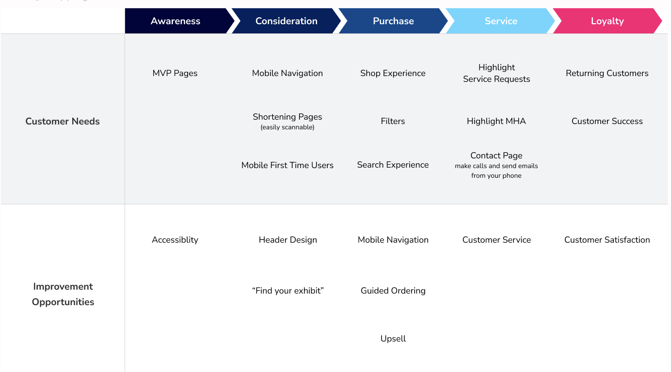
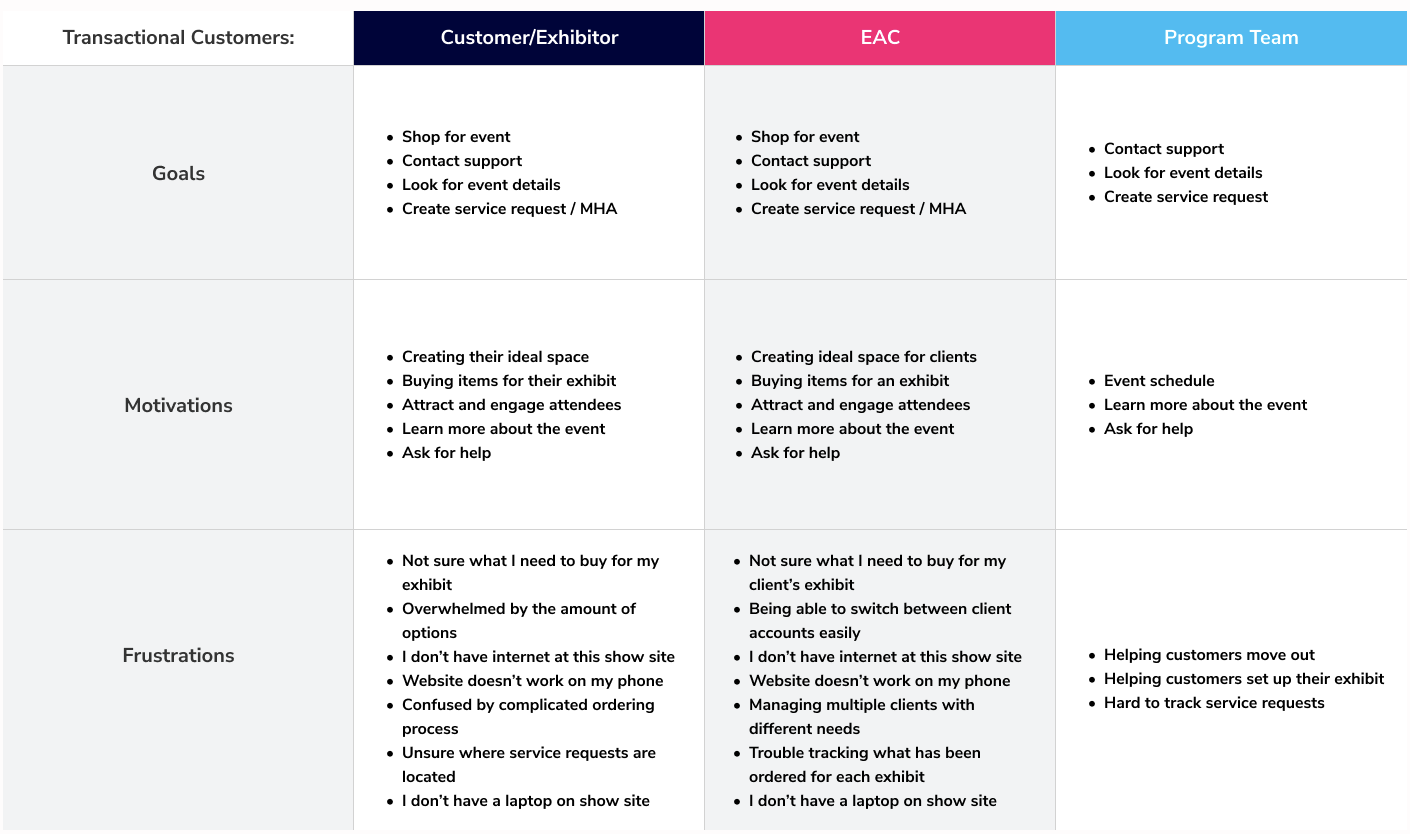
User Behavior Analysis: I identified that most users were avoiding the mobile version due to poor functionality, particularly during events when mobile access was essential. This research formed the foundation for securing leadership support for the responsive redesign initiative.
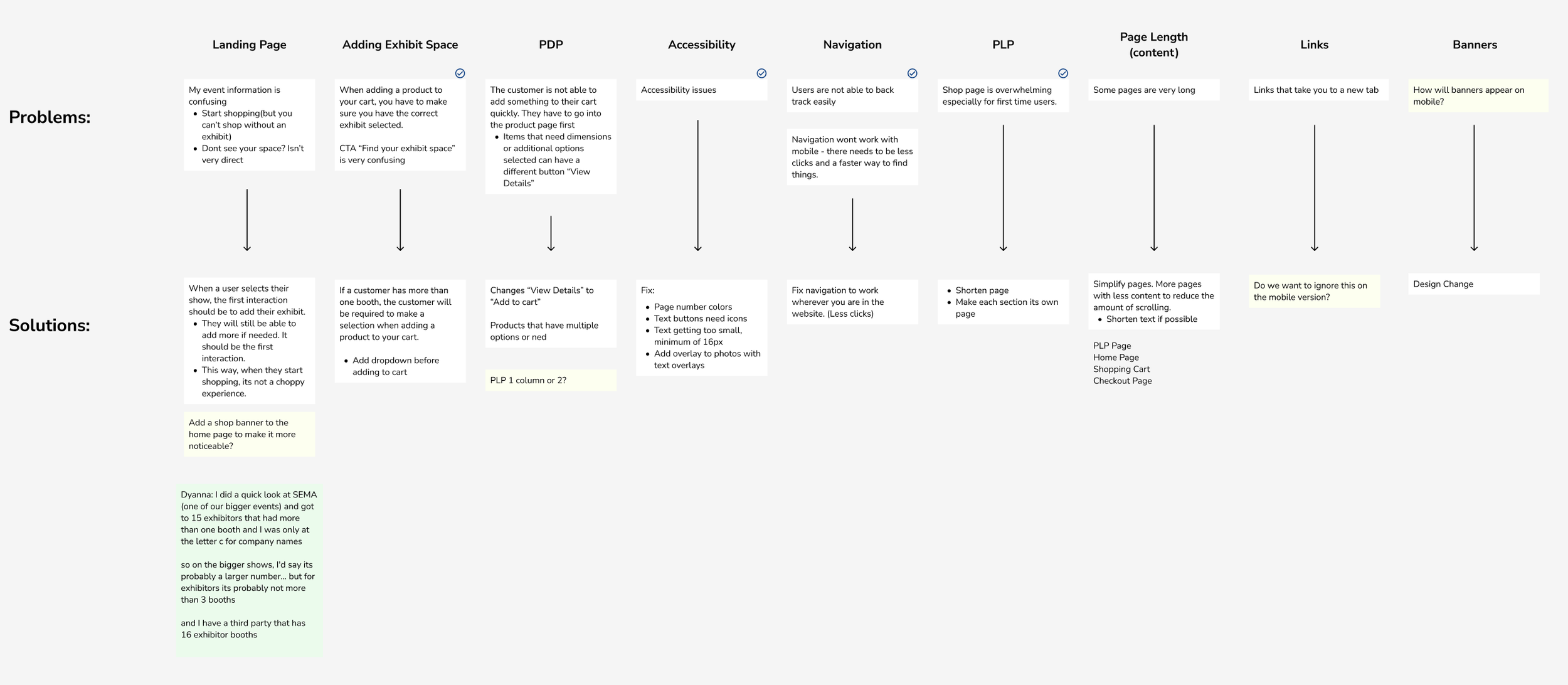
Navigation Architecture Assessment: I conducted an audit of the existing dual navigation system, which included both site-wide navigation and event-specific navigation. This complexity was creating user confusion and needed to be streamlined into a cohesive, responsive navigation structure.
Timeline and Resource Planning: Working within a June-September timeline constraint, I strategically prioritized which pages would deliver the highest impact for the available development capacity, ensuring maximum value delivery within the project window.
02. DESIGN
Navigation Redesign: I tackled the navigation challenge first, consolidating the dual navigation system into a single, intuitive structure that worked seamlessly across all device types. This foundational change improved the overall user experience and set the stage for responsive page designs.
Progressive Page Transformation: I systematically redesigned each prioritized page to be fully responsive, ensuring consistent design patterns, spacing, and visual hierarchy across desktop, tablet, and mobile breakpoints.
Design System Implementation: I established strict consistency standards for padding, margins, colors, and other design elements, creating a cohesive visual language that maintained brand integrity across all device experiences and page layouts.
Comprehensive Workflow Documentation: I designed detailed user workflows covering every interaction from sign-in through show creation, providing clear specifications for the offshore development team. This ensured accurate implementation and reduced the need for revisions.
Stakeholder Alignment Process: I presented each design phase to marketing and leadership stakeholders, securing approvals at every step to maintain project momentum and ensure the final solution met business requirements.
Conclusion
This responsive redesign project demonstrates a strategic approach to solving critical usability challenges while working within resource and timeline constraints. By prioritizing navigation simplification, establishing a systematic approach to responsive design, and maintaining consistent stakeholder communication, the project successfully transformed Freeman's website into a mobile-friendly platform that serves users effectively during events. The comprehensive workflow documentation and design system implementation not only ensured successful development handoff but also established a foundation for future website enhancements and consistent user experiences across all touchpoints.
Research
Navigation
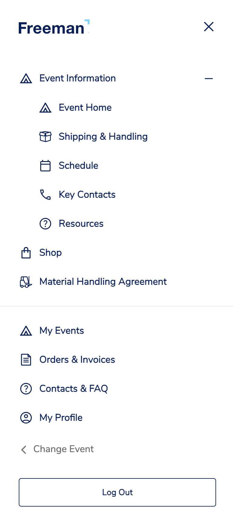
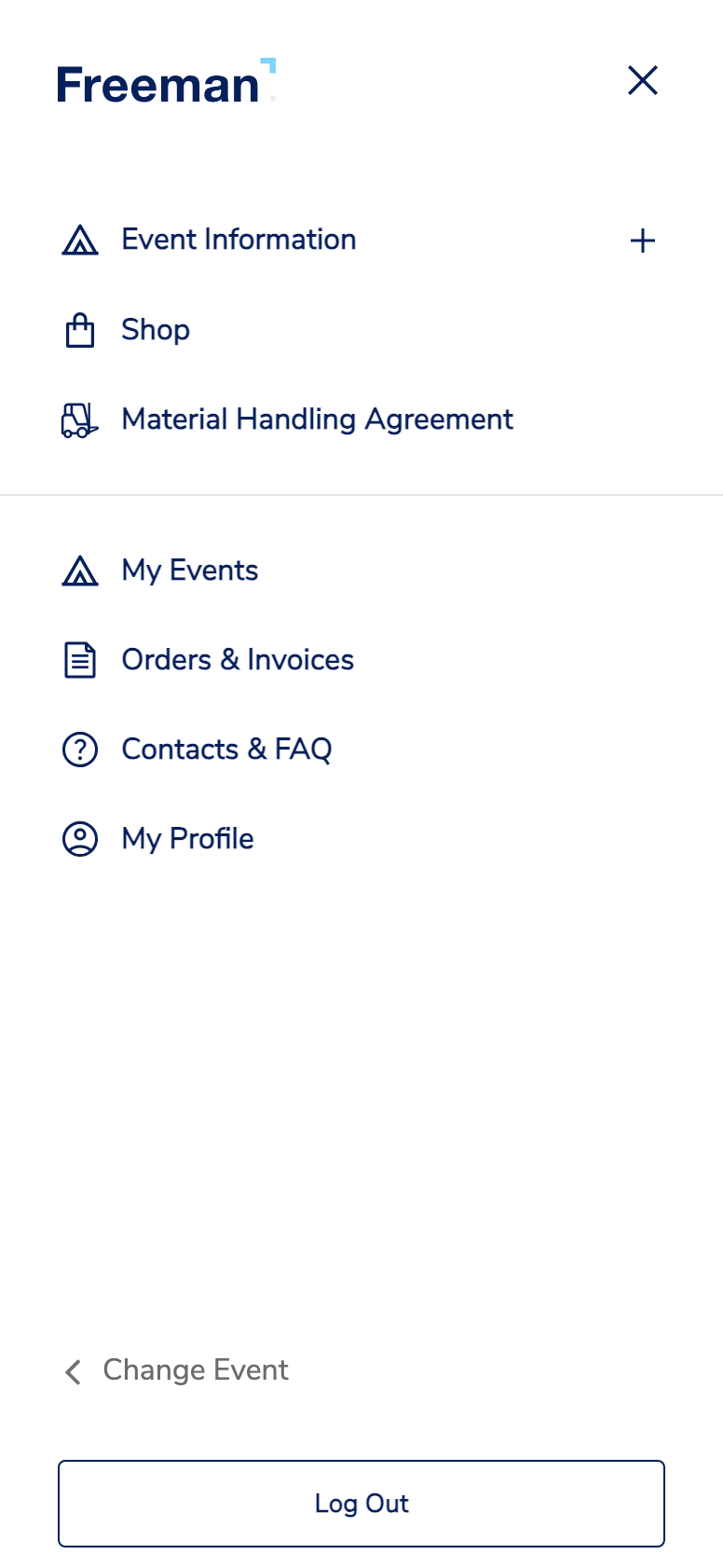
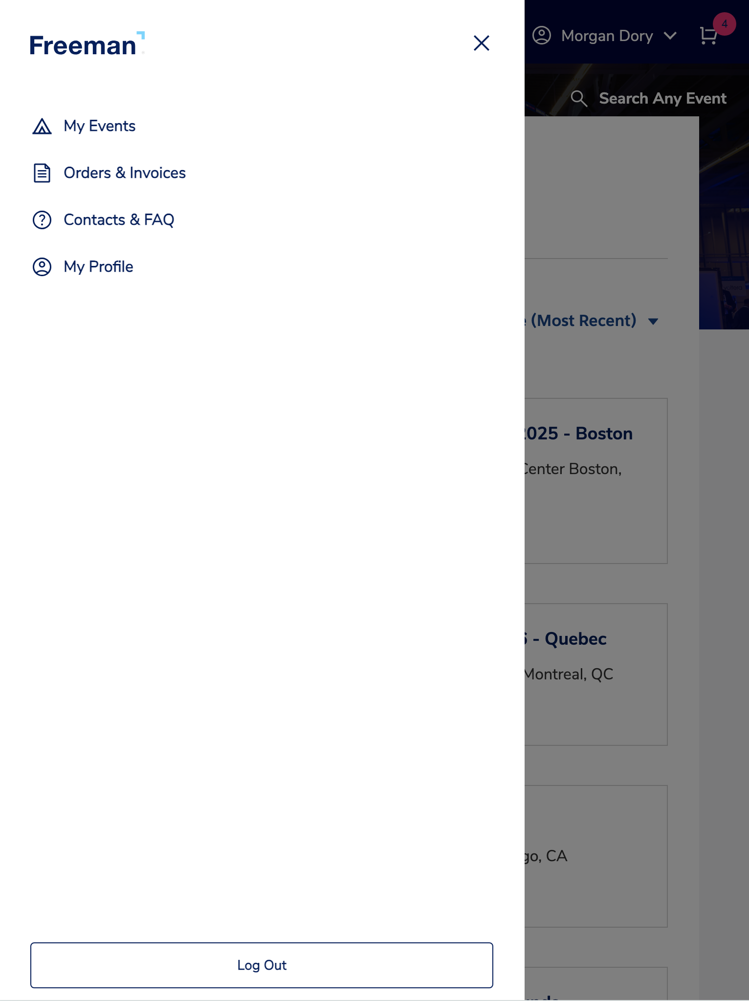
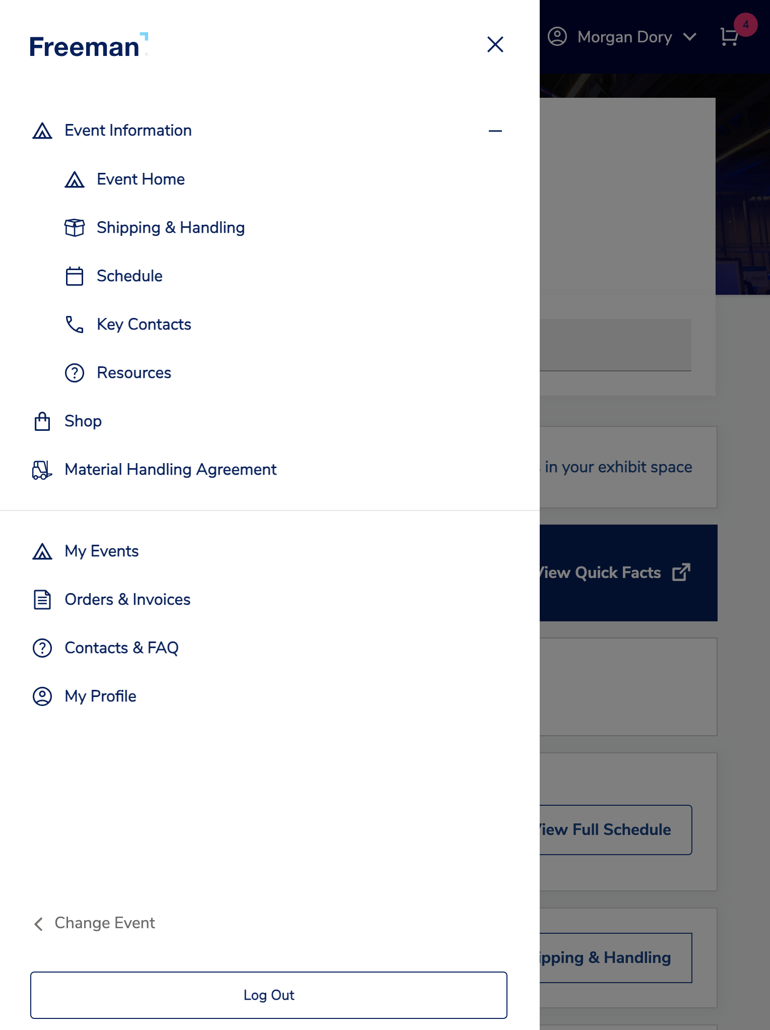
Designing mobile navigation for this event management platform was challenging due to its dual-navigation system. The interface switches between a global navigation and an event-specific sub-navigation that only appears when users enter an event.
Adding to the complexity, the navigation also changes based on authentication state, showing different options for logged-in versus logged-out users. Balancing these dynamic, contextual layers within mobile's limited screen space while maintaining clear user orientation required careful prioritization and visual hierarchy.
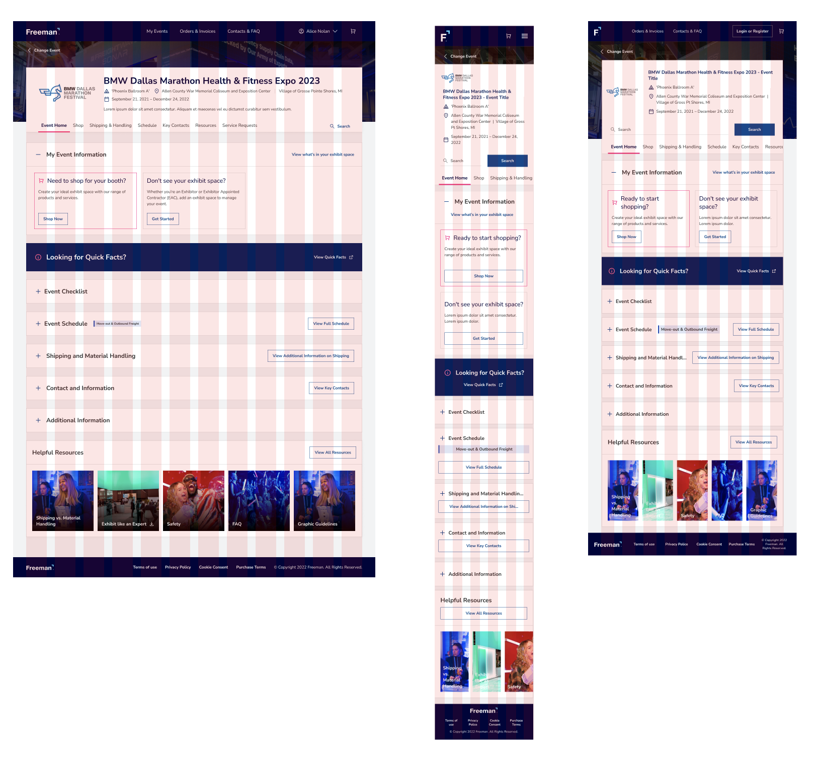
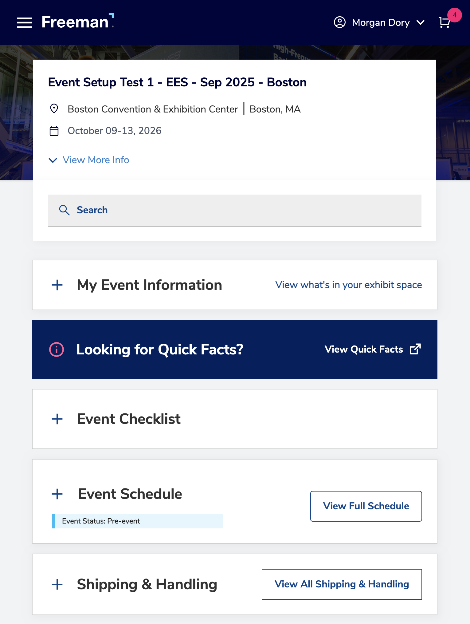
Desktop Design
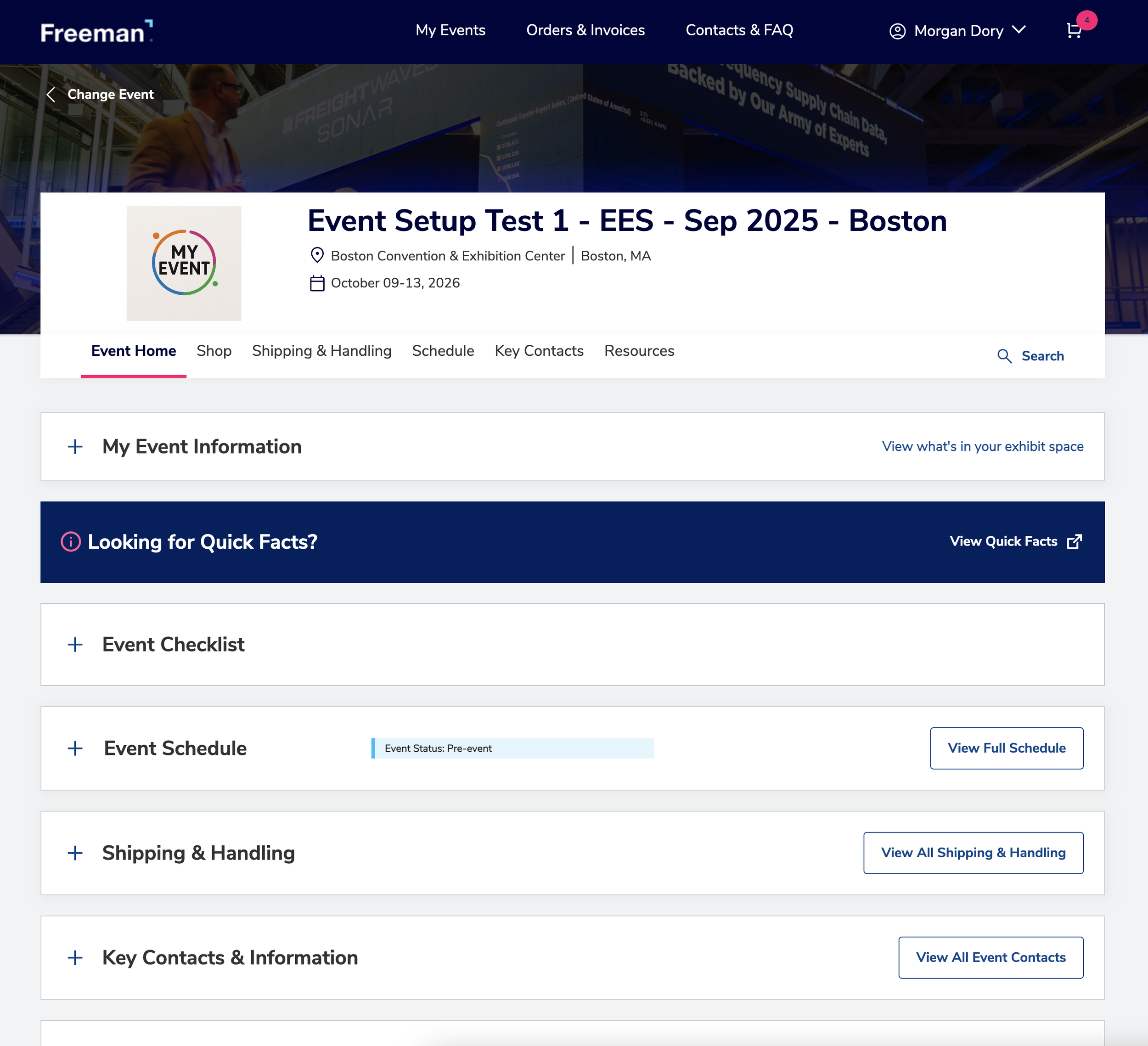
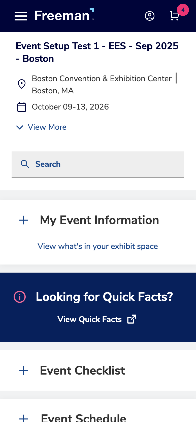
Mobile Design

Tablet Design
Page Breakdown
I joined this project after the desktop experience was already established, tasked with creating responsive mobile pages for a platform that hadn't been designed with mobile constraints in mind. The existing desktop patterns included dense information displays, multi-level navigation, and complex event management tools.
This required careful restructuring of content hierarchies, reimagining interaction patterns for touch interfaces, and making strategic decisions about what to surface immediately versus what to progressively disclose, all while maintaining consistency with the established desktop design system.
Landing Page
Desktop Design
Mobile Design
Tablet Design
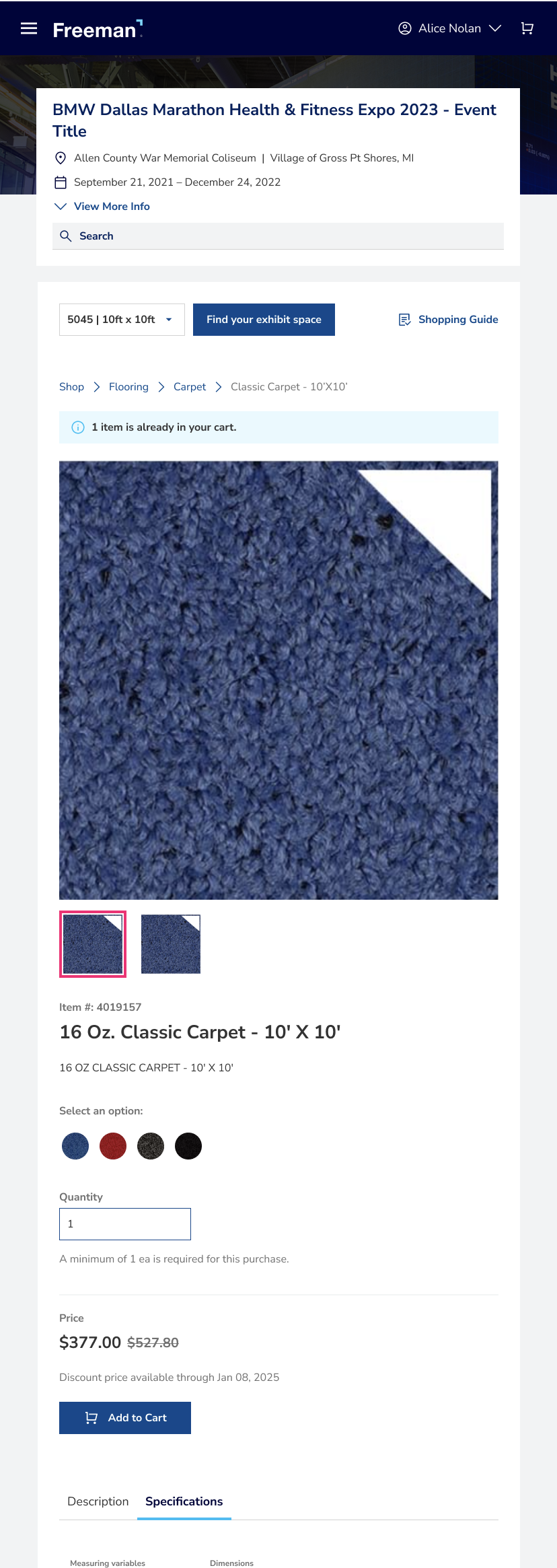
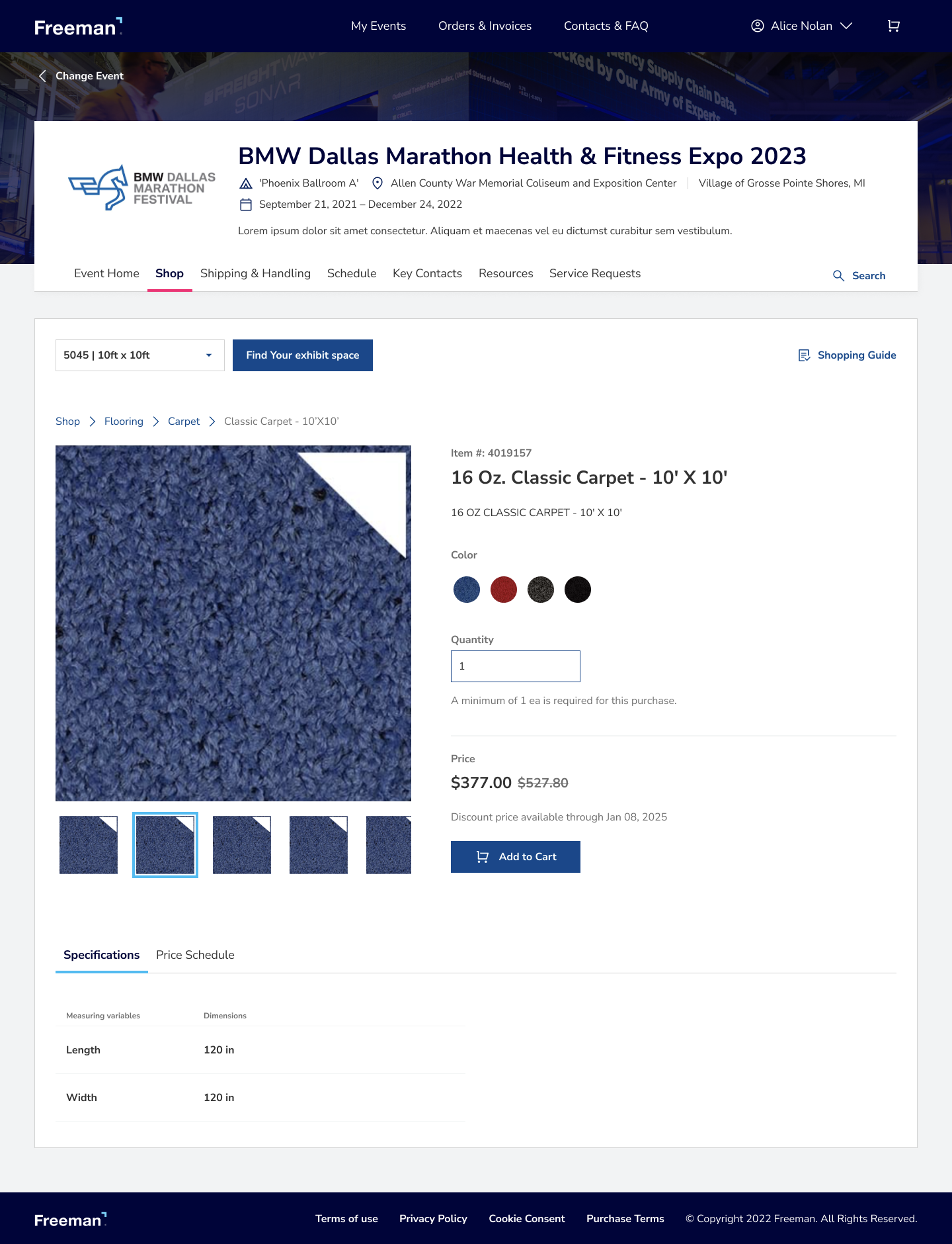
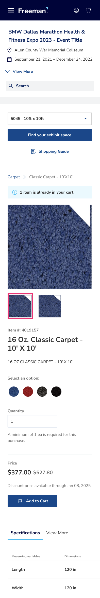
Product Page
Desktop Design
Mobile Design
Tablet Design