Centro
My Role:
UI/UX Designer
Team:
Product Managers (3)
Business / Validators
Tools:
Figma
Claude
Timeline:
November 2026 - (Still in progress)
Overview
Freeman runs trade shows for some of the biggest brands in the world, but internally, the team pulling those shows together was working across a patchwork of systems that were never meant to talk to each other. Salesforce for sales. SAP for finance. A TSS system built in the 90s. Passport for logistics. And a handful of spreadsheets holding everything together in between.
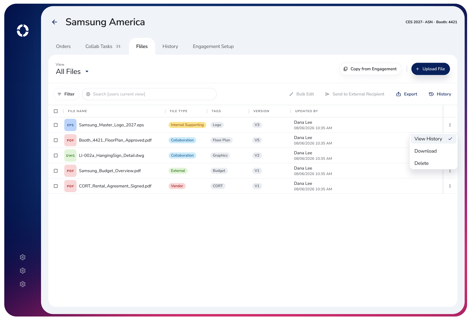
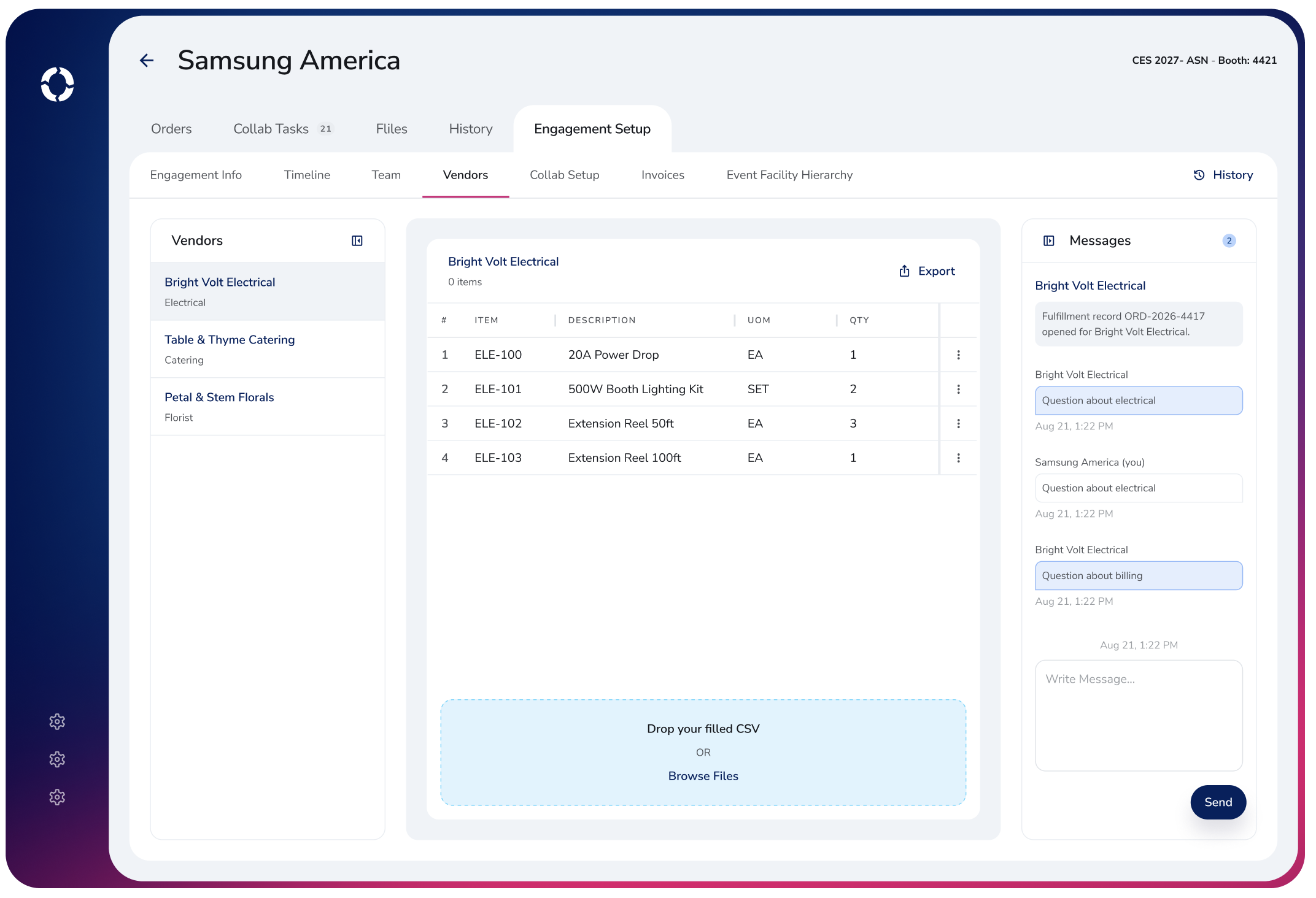
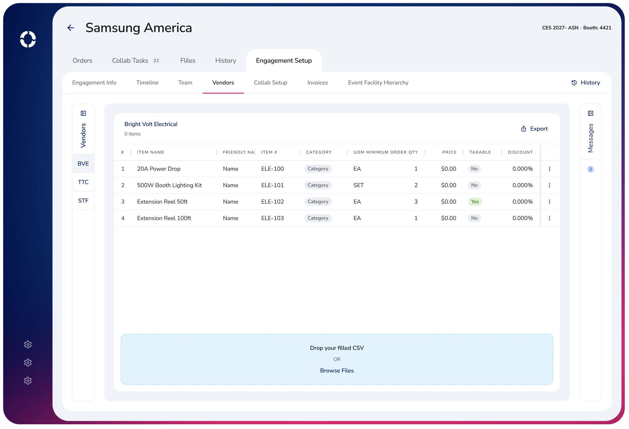
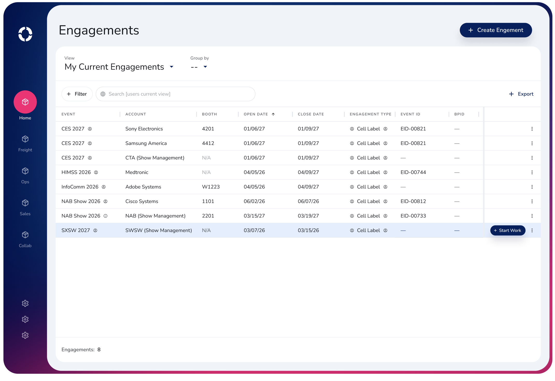
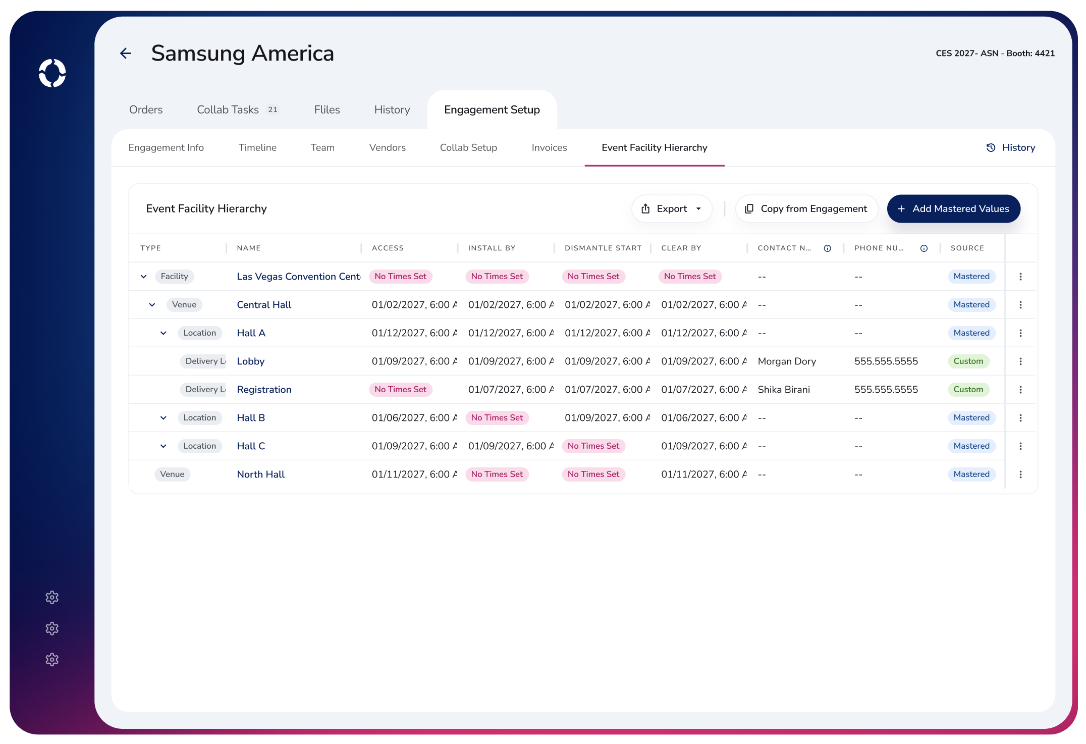
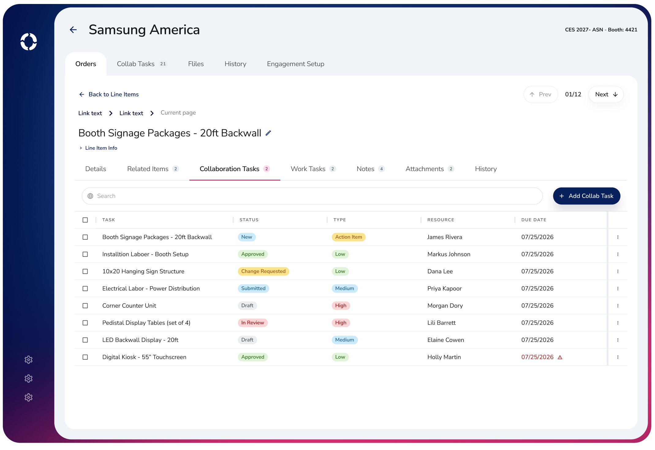
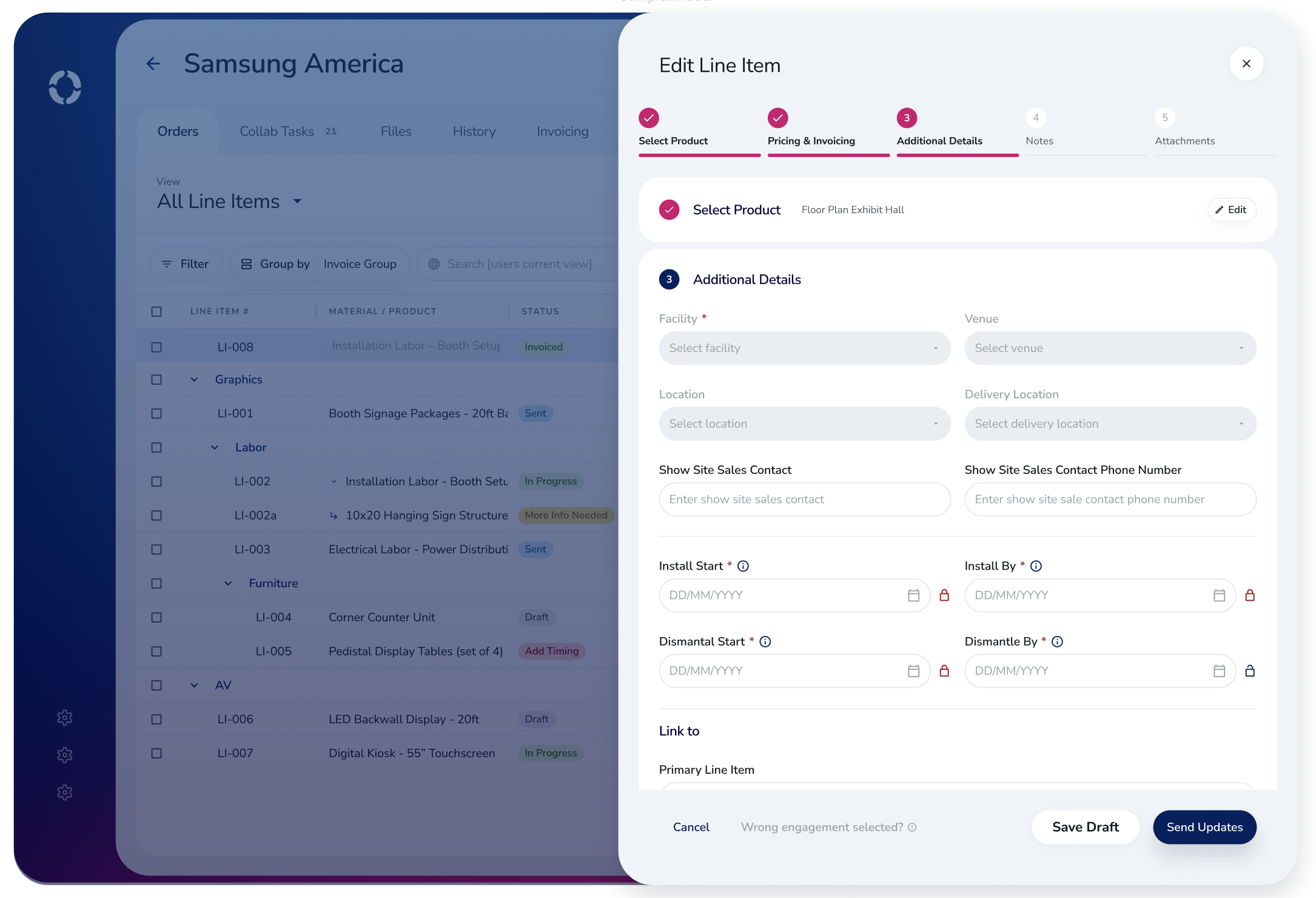
Centro is Freeman's answer to that fragmentation: one internal hub where employees can do their work without bouncing between five logins and five different mental models. I was brought on to design the Collaboration module, the part of Centro where sales and account teams set up a show for a client from the ground up: invoicing, delivery locations, timelines, vendors, full project teams, and the client-facing collaboration that happens when someone needs help ordering labor, graphics, or anything else specific to their booth.
The Challenge
This was not a small feature. Collaboration is one of the most complex parts of Centro, touching nearly every team involved in getting a client from "we're exhibiting at CES" to a fully built, staffed, and invoiced booth. And I was doing it alone, on a tight deadline, for a business that was explicit about wanting something completely different from what they had.
On top of that, Collaboration wasn't being built in isolation. Three other designers were working on separate modules of Centro at the same time, each solving different problems for different teams. Everything still needed to look and feel like one cohesive product when it shipped, which meant staying tightly aligned to a shared design system rather than making isolated decisions that only made sense for my own module.
That combination made the project a balancing act: push hard enough to give the business the bold, out-of-the-box interface they were asking for, while staying disciplined enough to keep four designers' worth of work feeling like a single, unified product.
Solution
Interview sales and account teams directly to surface real pain points and identify what to preserve from the existing workflow
Design a distinct, tablet-first interface that breaks completely from the look of Freeman's legacy systems (Salesforce, SAP, TSS, Passport)
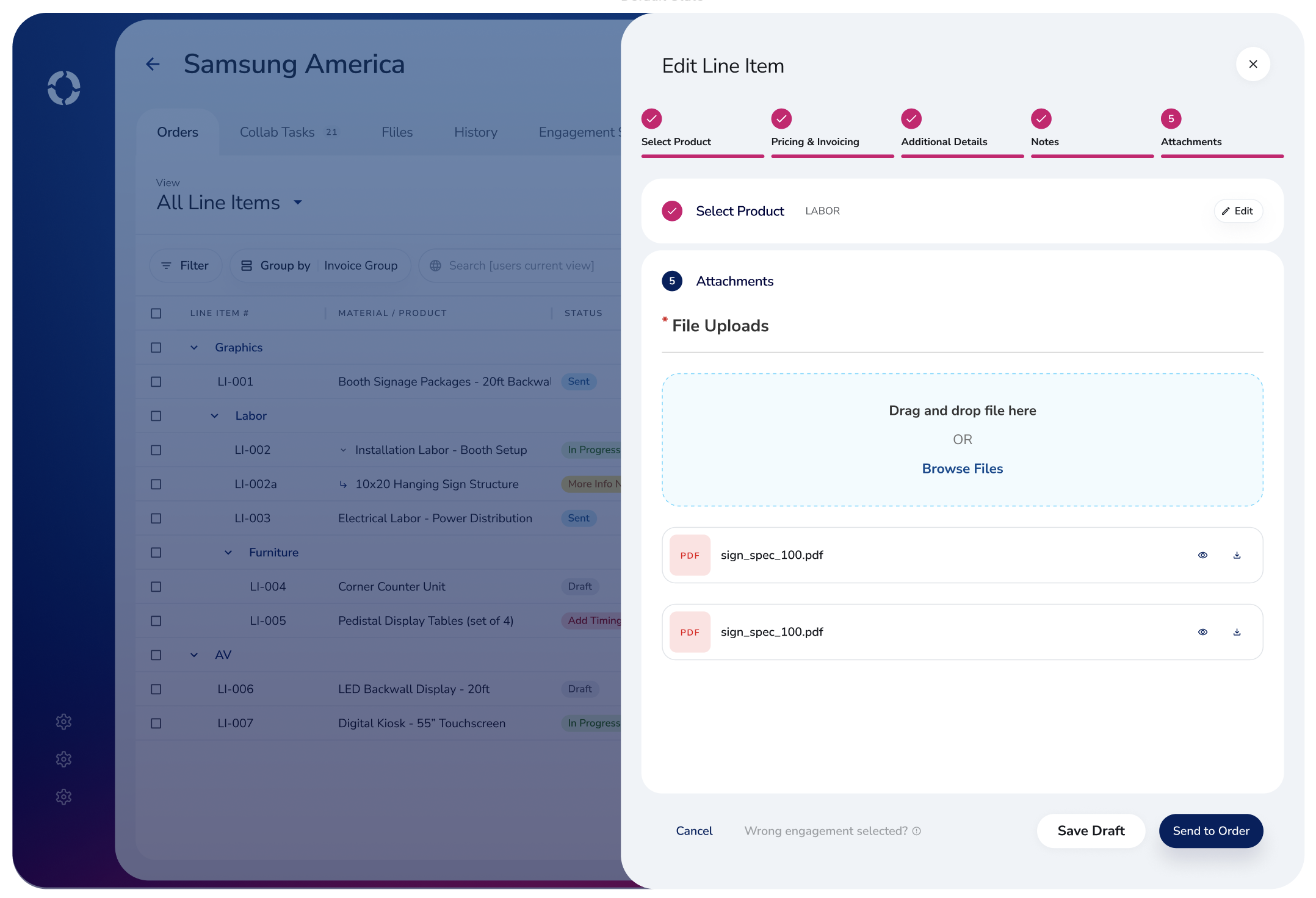
Restructure Collaboration around the natural shape of a show engagement, so orders, vendors, timelines, invoicing, and team setup all live in one connected flow instead of scattered tools
Build a fast, iterative design workflow using Claude connected to the design system via MCP, to move from written requirements to validated screens quickly under a tight solo deadline
Progress
01. RESEARCH & ANALYSIS
Stakeholder Interviews: I interviewed the sales and account teams who use these workflows daily, asking what was actively painful, what they'd fight to keep, and where the current tools were slowing them down.
Pain Point Mapping: From those conversations, I mapped friction points across the full engagement lifecycle, from initial show setup through vendor coordination and invoicing, and prioritized which ones to solve first.
Legacy System Audit: I reviewed how the same work currently happens across Salesforce, SAP, TSS, and Passport, identifying where teams were duplicating effort or losing information in the handoffs between systems.
02. DESIGN
AI-Assisted First Drafts: I connected Claude to our design system through MCP and used it to generate rough first-pass layouts from the business's written requirements, giving me a fast, system-grounded starting point for each screen.
Tablet-First Interface: I designed Collaboration to work as a tablet app first, since sales and account teams often need it on the show floor, then adapted the same interface to hold up cleanly on desktop.
Brand-Forward Visual System: I used Freeman's brand colors as full background treatments rather than small accents, moving the product away from the sterile, corporate feel of the tools it was replacing.
Information Architecture: I structured the module around orders, vendors, timelines, invoicing, and team assignments as connected parts of one engagement, so users can move between them without losing context.
03. VALIDATION & ITERATION
State-by-State Design: For each screen, I built out the full range of real states, including empty, loading, and error, rather than designing only the ideal path.
Continuous Business Review: Every round of design went back to the business for validation before moving forward, keeping stakeholders involved throughout instead of presenting a finished product with no prior visibility.
Conclusion
This is still a work in progress!
Site Map
Landing Page
Engagement Setup:
Delivery Locations
Engagement Setup:
Vendors
Orders
Orders
Files
Orders